Rethinking Digital Education
With the spread of COVID-19 and increasing restrictions on the public, state institutions such as schools are also closing. At this point in time, many schools lack a digital teaching concept.
I was part of a team to redesign the moodle App helping students overcome these difficult times of online schooling.

Challenge
The learning platform Moodle was published in 2002 and has not received any contemporary design updates since then. The structure and the visual appearance are no longer up-to-date and need revision in order to be a reliable service as a digital learning platform in the times of homeschooling. Students and teachers depend on it.
Scope
With the spread of COVID-19 and increasing restrictions on the public, state institutions such as schools are also closing. Children and young people can no longer study in their usual classrooms. They have to adapt to the current situation and attend classes from home. At this point in time, many schools lack a digital teaching concept. That's why they switched to digital learning platforms.
"Everything has to be done now to use and implement this motivation and willingness in a very concrete way through reliably functioning learning platforms."
Approach
In order to meet this requirement and to counteract this problem on the most frequently used learning platform, we redesigned the Moodle app. COVID-19 should not be significantly in the foreground of expediency. The app should still be relevant afterwards.

Our focus was on understanding the user and exploring different solutions. According to the idea "design the right thing. Design the thing right." we wanted to solve a relevant problem and validate our solutions based on user feedback in the process.
Result
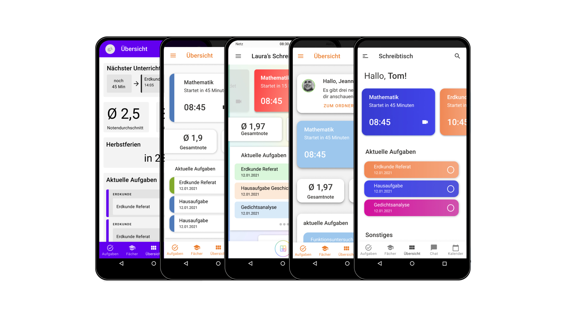
The final concept comprises a complete, all-encompassing, and reliable application. Thanks to the fast and intuitive navigation, everyday school life can be mastered quickly and easily. Every use case is covered, from a digital desk and a task overview to an extensive subject overview to a chat and calendar. The details of the core features are further described below.
Timeframe
December 2020 - January 2021 (6 weeks)
My Role
UX, UI, Research
The Process
Over the course of this project we have used many design methods that should help us with process control. This gave us an overview of the tasks and was able to gradually expand the insights gained and then apply them in a targeted manner. We worked very closely with the users in order to be able to validate and iterate our decisions at any time.
The Research

Status Quo
The first problems can be identified by self-exploration. It turns out that Moodle is very confusing and difficult to use. To check the findings, we have collected reviews of the app and analysed.

Appstore Reviews
The range of reviews of Moodle is overly broad. The reviews reflect, among other things, that due to the non-intuitive design of the app, the operation is severely restricted. It is often criticized that Moodle is very confusing. The variety of functions is positive.
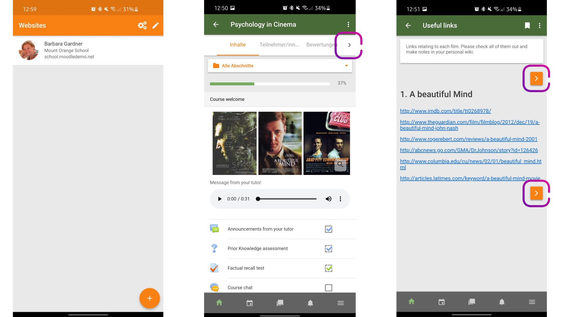
Screenflow
To get a detailed overview of the functional scope and the information architecture of the application, a screen flow is created. It is noticeable that Moodle has a very deep information architecture. This supports the knowledge gathered previously from the reviews that Moodle is not easy to use. Content is often difficult to access and is scattered on many different levels.

Navigation
Different navigations are used, such as lateral and bottom navigation. A three-point and burgermenu are also used. The combination of a deep information architecture, confusion and 4 different navigations leads to unsuccessful use of the application.

Feature List
In order to better understand moodle which functions and features the app brings, we have listed them in detail and provided an overview with post its. It turned out that the range of functions of Moodle is extremely large, but there is a lack of user-oriented implementation.

Competitor Analysis
A competitor analysis should help us to understand whether other apps are treating a similar problem and to check how they could have potentially solved it. As before with Moodle, screen flows are created to illuminate the depth of information and the range of functions.

Competitor Overview
Based on the knowledge gained, a table is created that lists all the features and functions recorded so far. These results are compared with the competitors and checked to see where there are similarities and differences in the range of functions. This gives an overview of which features are available in which application. From this, initial conclusions can be drawn as to which functions are necessary for the basic concept.
SWOT-Analysis
With a SWOT analysis, all aspects of Moodle should be divided into four categories: strengths, weaknesses, opportunities, and threats. This helps us to define problems, prioritize features and guide the decision-making process. Due to the many levels and incorrect prioritization, the loss of information is far too high. Accordingly, through better prioritization and differentiation, Moodle has enormous opportunities to be a comprehensive and powerful tool for everyday school life.


Target Group
To find the target group for the redesign, the potential user groups are first analysed. Among other things, the students, teaching staff, administrators and parents are considered. Schoolchildren and teaching staff are primarily dependent on the application. Secondly, parents can also use the application to support their children with online teaching. The administration is viewed as a tertiary user group. For the time being, the user group will be limited to students, teachers, and parents.
Interview & Testings
Interviews are carried out to find out the needs of current users of the app. This should help us to understand where further problems lie. In the interviews, we gave the interviewees additional tasks that they should solve in the app. Above all, the clarity of Moodle is criticized. The people to be tested often fail in the simplest of tasks and find certain content difficult.
User Story Mapping
We evaluated the interviews with user story mappings. With this technology we can get an overall picture of the user in his task and present it clearly. Based on these mappings, insights are filtered out and divided into “top, flop & need”. This subdivision is very helpful in the later course of the project. In this way, functions and features that are necessary can be better filtered out and classified.

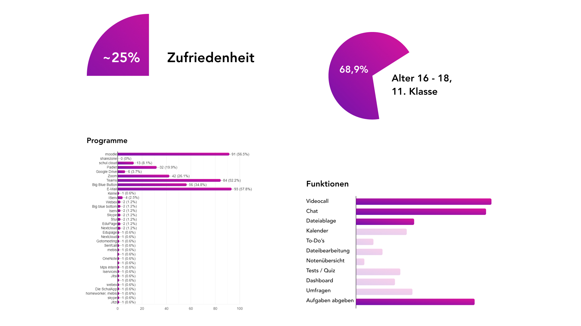

A quantitative survey is created so that the user group of students and teaching staff can be further analyzed. A total of 161 students and 61 teachers took part. It is noticeable among the students that the satisfaction rate is only 25%.
Since most of the students and teaching staff use Android devices, the redesign for Android is being considered.
Further public statistics are considered to support the findings of the quantitative survey that was conducted. These confirm that most students have an Android smartphone. The decision for an Android visual design is thus final.
Design Iterations
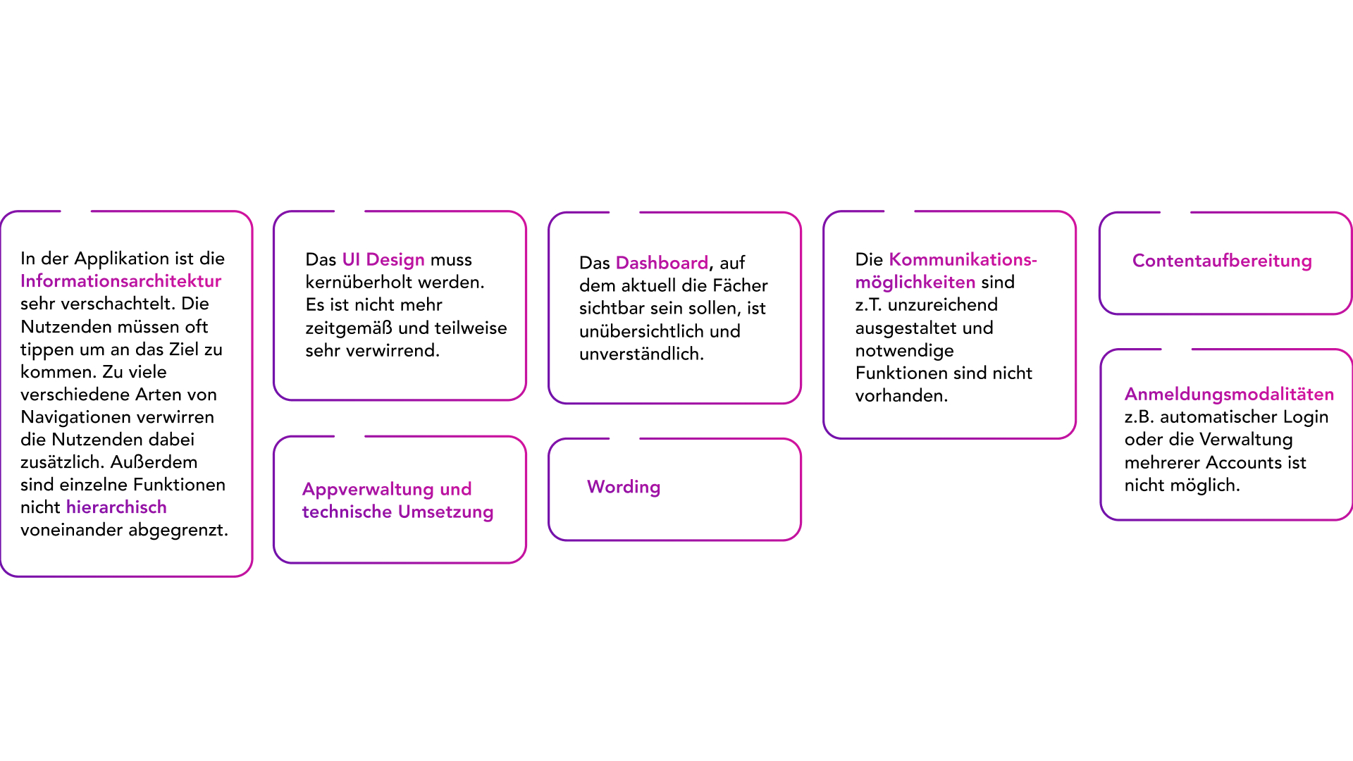
To summarize our research part, we have defined all the problems that have arisen.

Based on the problems, we can define user needs.
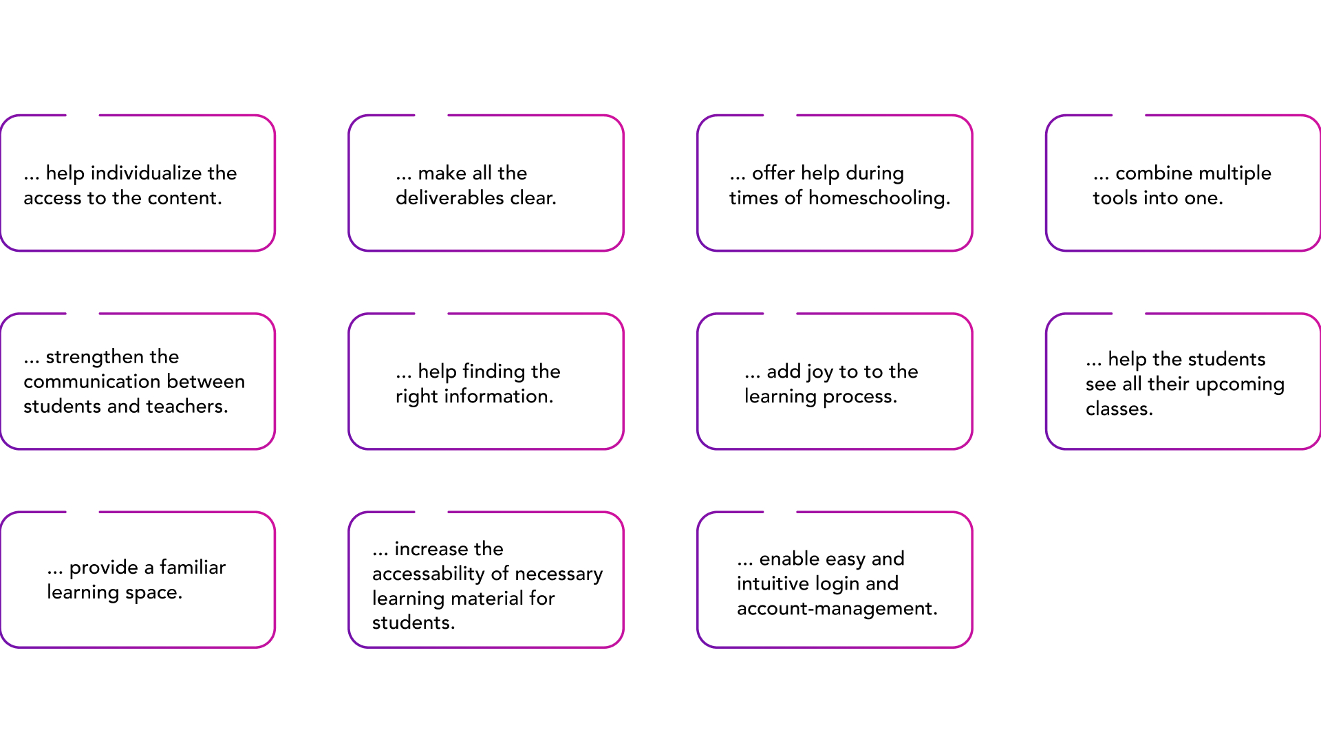
The previously defined user needs of the target group enable more detailed insight into their needs. With How Might We’s these needs can be reformulated as user-centered problems. In this way, they help with the choice of the necessary functions and features, as well as the development of the application.
Vision
“Moodle, as a communication and exchange platform, is intended to make a significant contribution to the digital education market. The users should use the app to cope with their everyday school life. The design of the app should focus on the content.”
For the further decision-making steps, we wanted to create a common vision in the team that would help us to move forward together and prevent misunderstandings in communication.


Kano Model
With the Kano model it is possible to filter which functions and features are relevant for the target group. The functions are divided into five categories with different properties. It turns out that the majority of the existing functions are expected by the target group and that some are “nice to have” in order to positively surprise the users. Features such as a blog, glossary or a payment function are not relevant and will be removed from the feature list.
Priorization
For the target group, the functions and features are each sorted in a coordinate system in order to establish a prioritization that is intended to significantly simplify the decisions during the design process. The frequency of use is indicated on the x-axis of the coordinate system, and the importance is defined on the y-axis. The hierarchy of information can be better determined using this prioritization.
Information Architecture
The information architecture is determined based on the prioritization of functions and features. During the process, this changes twice because of the results from the user testing. One of the biggest problems when creating the IA is cross-linking the different pages.


With the use cases, the concept of the app, as well as the information hierarchy can be validated. The most important application scenarios for using the app are defined below. The focus here is on the student as the primary target group.

The collected adjective clusters help to describe the characteristic. Accompanied by suitable images, they help define the direction of the app. With the generic terms “clear and intuitive”, “helpful and target-oriented” and “simple and fast”, previously recognized problems are perceived and remain in awareness for further elaboration.

A moodbaord should help us to lay the visual foundations and to check whether it fits with the knowledge we have gained. The bright “pop” colors are intended to motivate and bring dynamism to the use of the app. The use of bright colors is intended to increase the joy of using the app.

In addition to the mood board and research, inspiration is collected, with ideas for problem-solving approaches. Current trends come to the fore and ideas for the design style develop. Many designs with cards can be recognized from the inspiration board.
Design Principles
The design principles are based on the adjective clusters. As a basic building block for the following conception, it is essential to create a guideline so that the decision-making process proceeds step by step and purposefully. They create a basis for us to define the app on a meta-level. Basic principles for the following conception process help to find uniform solutions.

Sketches
First ideas are collected in order to visualize and substantiate the results from the research part. Here, general considerations for the design of the individual main pages such as the subjects, chat, profile or courses are outlined. This is an important step in the iteration process. In a further sketching phase, more specific considerations are made about navigation and the dashboard.

Proof of Concept
In order to test the information architecture and the sketches for their functionality, they are combined. The sketches are arranged in the information architecture. This checks whether all the necessary functions and cross-links are available. An overview of the information hierarchy and sketches help to check that everything has been taken into account.

In order to check the information architecture and hierarchical levels of the first wireframes, an initial testing is carried out. The result are that the proposed information architecture works. Tasks can be carried out, content is easily recognized. The information architecture will be further elaborated in the further course, as it scored positively in the test.
In a second testing it is noted that the profile picture in the top left is not perceived as a profile. This can be due to the fact that a placeholder image was used, but also because users do not suspect it at this point. The profile picture in the top left is then changed to a burger menu, where the user can then, for example, make specific settings.

Wireframe to Visual
After the final version of the wireframes, the first attempts to translate them into a visual language start. This sets the first milestones for the further visual design of this project. Each team member generates different screens with their own vision for the visual appearance of the app.
The Results & Next Steps


Learnings
We underestimated the scope of the app by far. That is why we had to distribute the tasks precisely so that we could manage the workload in the given time. In doing so, we learned above all to communicate such things and, if necessary, to give up work if you don't have the time. Prioritizing the tasks helped us to achieve a realistic result and not to lose ourselves in all unimportant details.
Wanting to do everything perfectly and precisely has often cost us time in the decision-making process. Perfectionism in design has its advantages and disadvantages.
The use of the methods and artifacts are immensely helpful for process control, but as a result unique features of a design can be lost.
Outlook
With the current status of the final prototype, it would be possible to carry out further testing in the future - also quantitatively and not just qualitatively. In addition, an increased fault tolerance could be built in to increase usability. Other roles in the app should be worked out, including parents and teachers.
Market Entry
Already in the research phase, it became clear that all existing applications were incomplete and inadequately implemented. The market is also large and stable. That is why an all-encompassing and reliable learning platform is necessary. Accordingly, the redesign of Moodle should be brought to all German educational institutions.